
Visual Design
As a fellow creative I’m drawn to the process of turning ideas into visual stories—building identities, campaigns, and digital experiences that feel both intentional and engaging. My work spans branding, editorial design, digital content, photography, and motion, bringing different mediums together to create cohesive visual systems.
01 — Brand & Visual Identity
Brand identities and visual systems built to translate a concept into a cohesive visual language across print, packaging, digital, and physical applications.
Role: Visual and Graphic Designer
Tools: Adobe Photoshop, Adobe InDesign, Procreate
.png)


Brand Identity, Packaging, Visual System
Sourdough bagels, baked for New York.
The Design Direction
The identity was built around the contrast between craft and city. Handmade textures, organic forms, and warm bakery tones communicate the care behind the product, while bold typography and a structured layout system create the clarity and energy needed for a fast-paced urban environment.
The goal was to make a familiar product feel contemporary without losing the warmth and authenticity associated with traditional baking.
.png)
Overview
Golden Crust is a modern sourdough bagel brand designed for a fast-paced New York audience of commuters, young professionals, and tourists. The concept combines the familiarity of a New York bagel shop with the craftsmanship and quality associated with artisan fermentation.

Visual System

Adelle Sans Devanagari - ExtraBold - pt.144

LTC GlobeGothic - Regular - pt. Varies


01 — CIRCLES
02 — TEXTURE
03 — ORGANIC FORMS
04 — COLOR

.png)

Draft — 01

Draft — 02

Draft — 03
Logo Development
The logo evolved from a detailed Procreate illustration into a refined, simplified mark. Geometric shapes brought structure and clarity, while organic forms were introduced to better capture the brand’s personality and create a more intentional visual identity.
#FFF4E4 - Flour
Base tone — reads as fresh dough, keeps packaging light on shelf.
#B48556 - Crust
Mid-tone for texture and secondary graphics — the color of a good bake.
#702200 - Char
#603402 - Roast
Primary brand color — deep enough to read as premium, not fast food.
Body text and deep shadow tone — grounds the palette without going black.
Color Palette
Applications
The system was extended across packaging, signage, merchandise, and environmental applications, creating a consistent identity while keeping the product at the center of the experience.


Event Identity, Campaign, Motion
Role: Visual and Motion Graphics Designer
Tools: Adobe Illustrator, Adobe Photoshop, Adobe After Effects
Overview
After Hours is an annual event concept built around exclusivity, scarcity, and nightlife culture. The visual identity combines a dark, energetic aesthetic with unexpected color and graphic elements to create a distinctive campaign designed to feel limited, immersive, and highly shareable.

The Concept
Designed around the idea of a one-night-only experience, the identity uses visual tension between dark, atmospheric tones and vibrant accents to communicate the anticipation and exclusivity of the event. The system was created to feel recognizable across every touchpoint while remaining flexible enough for social-first content.
Visual Direction
The visual language combines bold typography, saturated color, layered imagery, and graphic forms to create a sense of movement and energy. The contrast between structured layouts and expressive elements gives the identity a raw, contemporary character suited to an after-hours experience.
01 — Typography

Arial Black - Regular - pt. 175

Arial Black - Regular - pt. 175 - w Drip Acid Text Effects
02 — Color
A dark foundation paired with unexpected accent colors creates contrast and reinforces the nightlife atmosphere.
Bold type establishes hierarchy and creates a strong presence across static and animated content.
#A24CC7
Twilight
#45981E
After Glow
#7D91AF
Midnight Haze
#2C214E
After Dark
#FAFAFA
Flash
base background, the near-black night the whole system lives in.
an unnatural violet spike, the jolt that signals something supernatural is about to happen.
primary brand color, lifted straight from the logo's melt.
a muted blue-grey for shadows and gradients, the haze the storm leaves behind.
cool off-white that stays legible without warming up the storm.
03 — Graphic Elements
Layered shapes and expressive forms create a flexible visual language that can shift between promotional and informational content.



Fog
Lighting
Rain
Acid Drip Text
04 — Imagery
Photography and graphic treatments work together to create a sense of atmosphere, movement, and anticipation.


Draft — 01 Illustrator
Text Draft — 01 Illustrator
Draft — 02 Photoshop
Social Campaign
The identity was designed to extend naturally into social media, creating a series of static and motion-based assets that build anticipation leading up to the event. Content was designed around repeatable visual rules, allowing the campaign to remain cohesive while adapting to different formats and messages.


Motion Development
The visual system was translated into motion through animated typography, layered graphics, transitions, and rhythmic movement. Motion became an extension of the brand language, adding energy and creating social-first content designed to capture attention quickly.
From Static to Motion
The established visual system provided a foundation for motion, allowing typography, texture, lighting, and graphic elements to transition naturally from static campaign assets into animated social content.


Sip Into Summer
NYC Summer Campaign
Brand System, Social Design, Motion

Overview
Sip Into Summer is a summer campaign concept designed to introduce a new tequila brand to New York City through the energy of major sporting events, summer gatherings, and the city’s vibrant social culture. The campaign translates that atmosphere into a social-first visual identity across digital, promotional, and motion content.
The Concept
Sip Into Summer was created around the energy of New York City during the summer, when the city becomes a hub for international soccer and championship-level basketball. The campaign uses this convergence of major sporting moments, warm-weather gatherings, and NYC nightlife to create a social atmosphere centered around community and celebration.
The campaign introduces a new tequila brand to the NYC market by positioning it within the culture of summer socializing—creating a reason for people to gather, connect, and experience the brand together.
Visual Direction
The visual identity draws from the energy of summer in New York, combining vibrant color, bold typography, playful graphic elements, and original photography. The system balances the excitement of sports culture with the warmth of summer socializing, creating a visual language that feels energetic, celebratory, and distinctly urban.
#76CC66 -
Lime Splash
Fresh, zesty green inspired by a squeeze of lime
#F7CC8A -
Agave Glow
Warm golden peach inspired by golden-hour light and agave
#FFF9DF - Margarita Foam
#FFFFFF -
Salt Rim
Soft, creamy yellow that adds warmth without overpowering the palette
Soft off-white inspired by the margarita glass rim
Campaign-driven visuals designed to create cohesive, engaging experiences across social, digital, and event platforms.
02 — Campaign & Social Design
Graphic Elements
Organic shapes, citrus-inspired forms, and layered compositions create a flexible graphic language for the campaign. These elements add movement and personality while providing repeatable visual cues that connect individual pieces of content back to the larger system.

Lime pattern blended into the background
Organic line pattern to add movement
Margarita vector image to tie visual together
Salt rim added texture to visual

Composition
Dynamic compositions create
a sense of movement and spontaneity across the campaign. Layered imagery, oversized typography, and intentional cropping allow the system to adapt across different formats while maintaining a recognizable visual rhythm.


The Seasoned Table Editorial Campaign
Editorial Brand System, Print Design


Overview
The Seasoned Table is an editorial concept centered around the relationship between food, place, and the people who bring a dish to life. The brand combines culinary storytelling with photography, typography, and editorial design to create a warm, thoughtful visual experience inspired by the traditions and atmosphere surrounding the table.
The Concept
The concept was built around the idea that food is more than what is served—it is a reflection of culture, craft, memory, and connection. The visual identity was designed to feel intimate and editorial, balancing the warmth of a shared meal with the refinement of a contemporary food publication.
Visual Direction
The visual language combines organic imagery, expressive typography, and intentional composition to create a sense of warmth and authenticity. Photography plays a central role, allowing ingredients, textures, and finished dishes to become part of the identity rather than simply supporting the content.
Color Palette
#427596 -
Seaside Blue
The anchor tone — a deep, dusky blue-grey that reads like the Atlantic just after sunset off the Hamptons coastline.
#FBEA94 -
Lemon
A bright, citrus yellow used sparingly for appetite appeal the color of a lemon wedge on the raw bar, not a full wash of sunshine.
#C1C598 -
Dusty Sage
A muted, textural green pulled from coastal beach grass and hedgerows softens the palette so it doesn't skew too crisp or nautical.
#FFFFFF -
Linen White
The base tone crisp and airy, meant to evoke pressed table linens and clean editorial letterpress rather than a plain digital white.
The color palette draws from natural ingredients and culinary environments, creating a warm and grounded foundation that allows the food and photography to remain the visual focus.
Typography
Typography creates the foundation of the editorial system, pairing expressive display type with clean supporting text to establish hierarchy while maintaining a sense of warmth and character.

Aphrosine - Light - pt. 88
Didot - Bold - pt. 30


Didot - Italic - pt. 12
Photography
Photography focuses on natural textures, thoughtful composition, and the details of preparation and presentation, bringing the culinary experience into the visual identity.

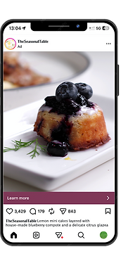
Editorial Applications
The visual system was extended across editorial and digital touchpoints, creating a consistent language for recipes, food stories, menus, and social content while allowing each piece to maintain its own visual rhythm.
Recipe Development
Recipes were developed alongside the visual direction, allowing the culinary content, photography, and editorial layouts to inform one another. Each recipe was developed with both the finished dish and its visual presentation in mind.

From concept to execution, menu appetizer & dessert pictured above
Editorial and print design focused on typography, composition, information hierarchy, and cohesive visual storytelling across physical and digital formats.
03 — Editorial & Visual Storytelling
Role: Visual and Motion Graphics Designer
Tools: Adobe Photoshop, Adobe After Effects, Photography
04 — Templates Broadcast & Visual Systems


My broadcast work focuses on turning complex and fast-moving information into clear visual stories. Typography establishes the hierarchy, while imagery, composition, and graphic elements provide context. Behind each piece is a flexible visual system that allows the design to adapt across stories, formats, and programming.
Purpose-built templates and reusable design systems that balance efficiency, consistency, and flexibility across recurring content.
Editorial & Lifestyle
Information Design · Typography · Visual Storytelling · Templates


News & Information
Working across breaking news and developing stories, I focused on creating graphics that communicated essential information quickly and clearly while maintaining visual consistency across the broadcast.
When the subject matter is serious, clarity becomes the priority.
Breaking Information


Explainers


Data & Context

