Estefania Cruz


Featured Work
A selection of projects combining design, motion, and original photography.

Event Identity, Campaign, Motion
The Concept:
L'Éclipse (the venue) is a "ghost" lounge an ultra-exclusive, subterranean bar located in a historical district of NYC’s West Village that remains closed 364 days a year. It only opens its doors on Halloween night for a 12-hour period known as "The After Hours" the event of the fall season!
The identity extends across social, digital, and motion-based content to create a cohesive campaign designed to feel limited, immersive, and highly shareable.
Role: Visual and Motion Graphics Designer
Tools: Adobe Illustrator, Adobe Photoshop, Adobe After Effects
Color Palette
#A24CC7
Twilight
#45981E
After Glow
#7D91AF
Midnight Haze
#2C214E
After Dark
#FAFAFA
Flash
base background, the near-black night the whole system lives in.
an unnatural violet spike, the jolt that signals something supernatural is about to happen.
primary brand color, lifted straight from the logo's melt.
a muted blue-grey for shadows and gradients, the haze the storm leaves behind.
cool off-white that stays legible without warming up the storm.
From Illutrator to PSD to AE Motion:
The transition from Photoshop to After Effects focused on "Atmospheric Realism."

Halloween Inspo created in Illustrator

PSD draft for Halloween package with color palette changes

Text Effect inspo drafted in Illustrator
Motion graphics piece for Halloween package with color palette changes
Elements


Fog
Lighting
Rain
Acid Drip Text
Noise Effect turned smoke effect
Advanced Lighting effect multiplied and looped
CC Rain
Particle World, Calculations,
CC Glass & Bevel for depth
Typography Hierarchy

Arial Black - Regular - pt. 175

Visual Identity
The system is built on a foundation of "Cinematic Static." By layering original photography with textured gradients and dark, serif-driven layouts, the identity feels both timeless and digital-native.
Event Wristband

Arial Black - Regular - pt. 175 - w Drip Acid Text Effects
The Anticipation - Social Media Motion Graphics


Brand Identity, Packaging, Visual System
Sourdough bagels, baked for New York.
Font: Adelle Sans Devanagari
.png)
.png)
.png)
CRAFT
Slow fermentation
Hand-shaped dough
Small-batch baking
CITY
Fast mornings
Commuters
Neighborhood culture
A modern sourdough bagel brand blending New York tradition with artisan fermentation and contemporary café culture.


.png)
Role: Visual and Graphic Designer
Tools: Adobe Photoshop, Adobe InDesign, Procreate


Typography Hierarchy

Adelle Sans Devanagari - ExtraBold - pt.144

LTC GlobeGothic - Regular - pt. Varies

Color Palette
#603402 - Roast
#FFF4E4 - Flour
Base tone — reads as fresh dough, keeps packaging light on shelf.
#B48556 - Crust
Mid-tone for texture and secondary graphics — the color of a good bake.
#702200 - Char
Primary brand color — deep enough to read as premium, not fast food.
Body text and deep shadow tone — grounds the palette without going black.
The identity combines bold typography, warm bakery tones, and organic forms to create a cohesive visual system across packaging, signage, and digital applications.
Logo Creation:


FROM BUSY
TO CRISP & INTENTIONAL


Elements
01 — CIRCLES
Derived from the bagel form.
02 — TEXTURE
Inspired by sourdough, flour and baked crust.
03 — ORGANIC FORMS
Inspired by handmade dough.
04 — TYPOGRAPHY
Bold, contemporary, highly legible.
05 — COLOR
Warm, golden bakery tones.


Editorial piece that inspired the brand creation.


National Margarita Day Campaign
Brand System, Social Design, Motion
A social-first campaign concept developed to promote National Margarita Day for a fictional bar and restaurant, The Citrus Social. Targeting audiences in their twenties and thirties, the campaign centers on vibrant, experience-driven visuals that highlight social connection and celebratory moments.
In response to shifting consumer habits around alcohol consumption, the campaign repositions the holiday as a shared, lifestyle-focused event. Promotions such as group drink specials informed the visual direction, encouraging engagement through collective experiences rather than individual consumption.
The design system combines bold typography, citrus-inspired color palettes, and dynamic compositions to create a cohesive identity across digital platforms. Photography was integrated with graphic design and motion to produce a series of Instagram-ready assets, blending authenticity with high-impact visuals.
Motion elements—including animated type and fluid transitions—extend the campaign into a more immersive, engaging experience across social media.
Color Palette
Elements

#76CC66 -
Lime Splash
Fresh, zesty green inspired by a squeeze of lime
#F7CC8A -
Agave Glow
Warm golden peach inspired by golden-hour light and agave
#FFF9DF - Margarita Foam
#FFFFFF -
Salt Rim
Soft, creamy yellow that adds warmth without overpowering the palette
Soft off-white inspired by the margarita glass rim

Lime pattern blended into the background
Organic line pattern to add movement
Margarita vector image to tie visual together
Salt rim added texture to visual
From Static to Motion
Social Media & Event Visuals


01 — Promotional
02 — Product
03 — Event
Role: Visual and Motion Graphics Designer
Tools: Adobe Photoshop, Adobe After Effects, Photography


Intro
The Seasoned Table applies culinary training to design: the palette, plating, and visual language all trace back to real ingredients and technique, then extend into a matching digital presence.
Strategy
Food-first thinking, not mood-board color. Culinary training shaped the palette through real plating and ingredients — then that same logic carried into social and event visuals, so print and digital share one system.
Color Palette
#427596 -
Seaside Blue
#FBEA94 -
Lemon
#C1C598 -
Dusty Sage
#FFFFFF -
Linen White
The anchor tone — a deep, dusky blue-grey that reads like the Atlantic just after sunset off the Hamptons coastline.
A bright, citrus yellow used sparingly for appetite appeal — the color of a lemon wedge on the raw bar, not a full wash of sunshine.
A muted, textural green pulled from coastal beach grass and hedgerows — softens the palette so it doesn't skew too crisp or nautical.
The base tone — crisp and airy, meant to evoke pressed table linens and clean editorial letterpress rather than a plain digital white.

_edited.png)
Typography Hierarchy
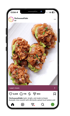
Social Media & Event Visuals


Motion Graphics
Trout Doodle
Procreate
Role: Visual and Motion Graphics Designer
Tools: Adobe Photoshop, Adobe After Effects, Photography
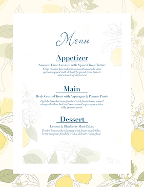
From concept to execution, menu appetizer pictured above
From concept to execution, menu dessert pictured above

Aphrosine - Light - pt. 88
Didot - Bold - pt. 30


Didot - Italic - pt. 12


What I do:
-
Visual Design: Brand systems, campaign visuals, and digital design
-
Motion Graphics: Short-form video, social content, and motion graphics
-
Art Direction: Concept development, visual storytelling, and image direction
Photography & Visual Content
Photography plays a key role in my design process. I create original imagery that supports branding, campaigns, and digital content—allowing for more cohesive and intentional visual storytelling.


